File
core/data-grid/data-grid.component.ts
Implements
DataGrid
OnChanges
AfterViewInit
ProductExperienceEventSource
Metadata
| host | { |
| providers |
)
|
| selector | c8y-data-grid |
| standalone | true |
| imports |
NgClass
LoadingComponent
C8yTranslateDirective
BsDropdownModule
CdkTrapFocus
IconDirective
PopoverModule
ProductExperienceDirective
NgTemplateOutlet
CdkDropList
CdkDrag
FormsModule
TooltipModule
NgPlural
NgPluralCase
CdkTable
CdkColumnDef
CdkHeaderCellDef
CdkHeaderCell
CdkCellDef
CdkCell
CellRendererComponent
FilteringFormRendererComponent
CdkFooterCellDef
CdkFooterCell
CdkHeaderRowDef
CdkHeaderRow
CdkRowDef
CdkRow
CdkFooterRowDef
CdkFooterRow
PaginationModule
AsyncPipe
SlicePipe
C8yTranslatePipe
MapFunctionPipe
FilterMapperPipe
GroupedFilterChips
VisibleControlsPipe
HumanizePipe
|
| templateUrl | ./data-grid.component.html |
Index
Constructor
constructor(configurationStrategy: DataGridConfigurationStrategy, dataGridService: DataGridService, sanitizer: DomSanitizer, gainsightService: GainsightService, alertService: AlertService, actionControlsService: ActionControlsExtensionService, route: ActivatedRoute)
|
||||||||||||||||||||||||
|
Parameters :
|
Inputs
| actionControls |
Type : ActionControl[]
|
|
Sets action controls (actions available for individual items). |
| activeClassName |
Type : string
|
Default value : 'active'
|
|
Sets the class name used for active rows (last clicked). Set empty string to disable appending active class to grid rows. |
| bulkActionControls |
Type : BulkActionControl[]
|
|
Sets bulk action controls (actions available for items selected by user). |
| childNodePagination |
Type : Pagination
|
|
Child node pagination settings, e.g. allows for setting page size of loaded child node pages. |
| childNodesProperty |
Type : string
|
|
In a client side data fed tree-grid, this input determines the name of the
property holding the child nodes of the current node.
Default value is |
| columns |
Type : Column[]
|
|
The list of columns to be displayed in the grid. |
| configureColumnsEnabled |
Type : boolean
|
Default value : true
|
|
Determines if custom columns button will be enabled. |
| displayOptions |
Type : Partial<DisplayOptions>
|
|
Sets display options. |
| headerActionControls |
Type : HeaderActionControl[]
|
|
Sets header action controls (actions available from data grid header). |
| hideReload |
Type : boolean
|
Default value : false
|
|
Determines if the Reload button will be hidden. |
| infiniteScroll |
Type : LoadMoreMode
|
|
Sets load more mode. |
| loading |
Type : boolean
|
Default value : false
|
|
Determines whether the grid is in a loading state. To be used in client side data scenarios where data is assigned using |
| loadingItemsLabel |
Type : string
|
Default value : gettext('Loading items…')
|
|
The label for loading indicator. |
| loadMoreItemsLabel |
Type : string
|
Default value : gettext('Load more items')
|
|
The label for load more button. |
| pagination |
Type : Pagination
|
|
Pagination settings, e.g. allows for setting current page or page size. |
| parentNodeLabelProperty |
Type : string
|
Default value : 'id'
|
|
In a tree-grid, this input determines the name of the property that will be used as a label to refer to the parent node its pagination row. |
| refresh |
Type : EventEmitter<void>
|
|
Takes an event emitter. When an event is emitted, the grid will be reloaded. |
| rows |
Type : Row[]
|
|
The list of rows to be displayed in the grid (used for client side data). |
| searchText |
Type : string
|
Default value : ''
|
|
Sets initial search text. |
| selectable |
Type : boolean
|
|
Determines whether items can be selected by clicking a checkbox in the first column. |
| selectionPrimaryKey |
Type : string
|
|
Determines which item's property will be used to distinguish selection status. |
| serverSideDataCallback |
Type : ServerSideDataCallback
|
|
Sets a callback function which will be invoked whenever data needs to be loaded from server. The function should take [[DataSourceModifier]] and return [[ServerSideDataResult]]. |
| showCounterWarning |
Type : boolean
|
Default value : false
|
|
Shows the warning for the sub-assets counter |
| showSearch |
Type : boolean
|
Default value : false
|
|
Determines whether text search input is shown in the grid's header. |
| singleSelection |
Type : boolean
|
|
Restricts selection to a single row only. Selection column displays radio button instead of checkboxes |
| title |
Type : string
|
Default value : gettext('Items')
|
|
The title for the data grid, it's displayed in the grid's header. |
| treeGrid |
Type : boolean
|
|
Determines if the data grid is a tree grid. If set to true, an additional column with expand/collapse button is displayed for rows with child nodes. |
Outputs
| itemsSelect |
Type : EventEmitter
|
|
Emits an event when items selection changes. The array contains keys of selected items (key property is defined by |
| onAddCustomColumn |
Type : EventEmitter
|
|
Emits an event when a custom column is added |
| onBeforeFilter |
Type : EventEmitter
|
|
Emits an event before the filter is applied. |
| onBeforeSearch |
Type : EventEmitter
|
|
Emits an event before the search is performed. |
| onColumnFilterReset |
Type : EventEmitter
|
|
Emits an event after the column filter has been reset |
| onColumnReordered |
Type : EventEmitter
|
|
Emits an event when column order has been changed |
| onColumnVisibilityChange |
Type : EventEmitter
|
|
Emits an event when column order has been changed |
| onConfigChange |
Type : EventEmitter
|
|
Emits an event when grid's configuration is changed. |
| onFilter |
Type : EventEmitter
|
|
Emits an event when a filter is applied in a column. |
| onPageSizeChange |
Type : EventEmitter
|
|
Emits an event when page size has been changed |
| onReload |
Type : EventEmitter
|
|
Emits an event when reload button is clicked. |
| onRemoveCustomColumn |
Type : EventEmitter
|
|
Emits an event when a custom column is removed |
| onSort |
Type : EventEmitter
|
|
Emits an event when column sorting has been changed |
| rowClick |
Type : EventEmitter
|
|
Emits an event when a row is clicked. |
| rowMouseLeave |
Type : EventEmitter
|
|
Emits an event when mouse leaves a row. |
| rowMouseOver |
Type : EventEmitter
|
|
Emits an event when mouse is over a row. |
Methods
| applyFilter | ||||||||||||
applyFilter(columnName: unknown, dropdown: unknown, filteringModifier: unknown)
|
||||||||||||
|
Parameters :
Returns :
void
|
| cancel |
cancel()
|
|
Returns :
void
|
| changeSelectedItem | ||||||
changeSelectedItem(item: any)
|
||||||
|
Parameters :
Returns :
void
|
| changeSortOrder | ||||||
changeSortOrder(columnName: unknown)
|
||||||
|
Parameters :
Returns :
void
|
| clearFilters | ||||||||
clearFilters(reload: unknown)
|
||||||||
|
Parameters :
Returns :
void
|
| clickReload |
clickReload()
|
|
Returns :
void
|
| collapse | ||||||
collapse(row: Row)
|
||||||
|
Parameters :
Returns :
void
|
| collapseNode | ||||||
collapseNode(row: Row)
|
||||||
|
Parameters :
Returns :
void
|
| confirmRemoveColumn | ||||||
confirmRemoveColumn(column: Column)
|
||||||
|
Parameters :
Returns :
void
|
| emitConfigChange | ||||||
emitConfigChange(eventType?: GridEventType)
|
||||||
|
Parameters :
Returns :
void
|
| expand | ||||||
expand(row: Row)
|
||||||
|
Parameters :
Returns :
any
|
| expandNode | ||||||
expandNode(row: Row)
|
||||||
|
Parameters :
Returns :
void
|
| getCellRendererSpec | |||||
getCellRendererSpec(undefined: unknown)
|
|||||
|
Parameters :
Returns :
CellRendererSpec
|
| getFilteringFormRendererSpec | |||||
getFilteringFormRendererSpec(undefined: unknown)
|
|||||
|
Parameters :
Returns :
FilteringFormRendererSpec
|
| getHeaderCellRendererSpec | |||||
getHeaderCellRendererSpec(undefined: unknown)
|
|||||
|
Parameters :
Returns :
CellRendererSpec
|
| handleClick | ||||||
handleClick(row: Row)
|
||||||
|
Parameters :
Returns :
void
|
| isColumnFilteringApplied | ||||||
isColumnFilteringApplied(column: Column)
|
||||||
|
Parameters :
Returns :
boolean
|
| isDropDownPlacedRight | ||||||
isDropDownPlacedRight(column: Column)
|
||||||
|
Parameters :
Returns :
boolean
|
| isItemSelected | ||||||
isItemSelected(item: unknown)
|
||||||
|
Parameters :
Returns :
any
|
| loadNextPage |
loadNextPage()
|
|
Returns :
Promise<IResultList<object>>
|
| ngAfterViewInit |
ngAfterViewInit()
|
|
Returns :
void
|
| ngOnChanges | ||||||
ngOnChanges(event: unknown)
|
||||||
|
Parameters :
Returns :
void
|
| ngOnDestroy |
ngOnDestroy()
|
|
Returns :
void
|
| ngOnInit |
ngOnInit()
|
|
Returns :
void
|
| onColumnDrop | |||||
onColumnDrop(undefined: unknown)
|
|||||
|
Parameters :
Returns :
void
|
| Async openCustomColumn |
openCustomColumn()
|
|
Returns :
any
|
| performSearch | ||||||
performSearch(searchText: string)
|
||||||
|
Parameters :
Returns :
void
|
| reload | ||||||||
reload(redirect: unknown)
|
||||||||
|
Parameters :
Returns :
void
|
| Async removeFilter | ||||||
removeFilter(filter: Partial
|
||||||
|
Parameters :
Returns :
any
|
| resetFilter | |||||||||
resetFilter(columnName: unknown, dropdown: unknown)
|
|||||||||
|
Parameters :
Returns :
void
|
| resolveCellValue | |||||||||
resolveCellValue(row: unknown, path: unknown)
|
|||||||||
|
Parameters :
Returns :
any
|
| setAllItemsInCurrentPageSelected | ||||||
setAllItemsInCurrentPageSelected(selected: unknown)
|
||||||
|
Parameters :
Returns :
void
|
| setAllItemsSelected | ||||||
setAllItemsSelected(selected: unknown)
|
||||||
|
Parameters :
Returns :
void
|
| setColumns | ||||||
setColumns(config: GridConfig)
|
||||||
|
Parameters :
Returns :
void
|
| setExpandableRowVisible |
setExpandableRowVisible(row: Row, success: boolean)
|
|
Returns :
void
|
| setItemsSelected | |||||||||
setItemsSelected(items: any, selected: unknown)
|
|||||||||
|
Parameters :
Returns :
void
|
| setPageSize | ||||||
setPageSize(config: GridConfig)
|
||||||
|
Parameters :
Returns :
void
|
| trackByName | |||||||||
trackByName(index: unknown, item: unknown)
|
|||||||||
|
Parameters :
Returns :
any
|
| triggerEvent | ||||||
triggerEvent(eventData: unknown)
|
||||||
|
Parameters :
Returns :
void
|
| updateChildPagination | |||||||
updateChildPagination(undefined: unknown, undefined: unknown)
|
|||||||
|
Parameters :
Returns :
void
|
| updateFiltering | ||||||||||||||||
updateFiltering(columnNames: string[], action: literal type, reload: unknown)
|
||||||||||||||||
|
Parameters :
Returns :
void
|
| updateFilteringApplied |
updateFilteringApplied()
|
|
Returns :
void
|
| updateGridColumnsSize |
updateGridColumnsSize()
|
|
Returns :
void
|
| updatePagination | |||||
updatePagination(undefined: unknown)
|
|||||
|
Parameters :
Returns :
void
|
| updateSorting | |||||||||
updateSorting(columnNames: string[], sortOrder: SortOrder)
|
|||||||||
|
Parameters :
Returns :
void
|
| updateThEls |
updateThEls()
|
|
Returns :
void
|
Properties
| actionControls |
Type : ActionControl[]
|
Default value : []
|
| builtInActionType |
Type : object
|
Default value : {
Edit: BuiltInActionType.Edit,
Delete: BuiltInActionType.Delete,
Export: BuiltInActionType.Export
}
|
| bulkActionControls |
Type : BulkActionControl[]
|
| canRetrieveAssetProperties |
Type : unknown
|
Default value : inject(AssetPropertyService)?.canRetrieveAssetProperties()
|
| columnNames |
Type : []
|
Default value : []
|
| columnRenderers |
Type : QueryList<ColumnDirective>
|
Decorators :
@ContentChildren(ColumnDirective)
|
| columns |
Type : Column[]
|
Default value : []
|
| columnsWithFiltersApplied |
Type : Column[]
|
Default value : []
|
| Public configurationStrategy |
Type : DataGridConfigurationStrategy
|
Decorators :
@Optional()
|
| currentPageSelectionState |
Type : object
|
Default value : {
allSelected: false,
allDeselected: true
}
|
| Optional currentRemoveCustomColumnPopover |
Type : PopoverDirective
|
| dataSource |
Type : unknown
|
Default value : new GridDataSource()
|
| displayOptions |
Type : DisplayOptions
|
Default value : {
striped: true,
bordered: false,
gridHeader: true,
filter: true,
hover: true,
showLoadingIndicator: true
}
|
| emptyState |
Type : EmptyStateContextDirective
|
Decorators :
@ContentChild(EmptyStateContextDirective)
|
| emptyStateContext$ |
Type : Observable<DataSourceStats>
|
| expandableRow |
Type : ExpandableRowDirective
|
Decorators :
@ContentChild(ExpandableRowDirective)
|
| expandedRows |
Type : Map<Row | literal type>
|
Default value : new Map()
|
|
A map of rows which have been expanded. |
| filteringApplied |
Type : unknown
|
Default value : false
|
| filteringLabelsParams |
Type : object
|
Default value : {
filteredItemsCount: 0,
allItemsCount: 0
}
|
| filtersHelpPopoverHtml |
Type : string
|
Default value : gettext('Click the column headers to apply filters.')
|
| headerActionControls |
Type : HeaderActionControl[]
|
| hidePagination$ |
Type : unknown
|
Default value : this.totalPagesCount$.pipe(
map(totalPagesCount => totalPagesCount <= 1),
delay(0) // prevents ExpressionChangedAfterItHasBeenCheckedError
)
|
| infiniteScroll |
Type : LoadMoreMode
|
| infiniteScrollContainer |
Type : ViewContainerRef
|
Decorators :
@ViewChild('infiniteScrollContainer', {static: false, read: ViewContainerRef})
|
| isConfigContextKnown |
Type : unknown
|
Default value : false
|
| isDataRow |
Type : unknown
|
Default value : () => {...}
|
| isPaginationRow |
Type : unknown
|
Default value : () => {...}
|
| isRowExpanded |
Type : unknown
|
Default value : () => {...}
|
| lastClickedRow |
Type : Row
|
| loadMoreComponent |
Type : LoadMoreComponent
|
| Readonly minPossiblePageSize |
Type : unknown
|
Default value : Math.min(...this.possiblePageSizes)
|
| pagination |
Type : Pagination
|
| paginationLabelParams |
Type : object
|
Default value : {
pageFirstItemIdx: 0,
pageLastItemIdx: 0,
itemsTotal: 0
}
|
| Readonly possiblePageSizes |
Type : number[]
|
Default value : [25, 50, 100]
|
| productExperienceEvent |
Type : ProductExperienceEvent
|
Default value : { eventName: PX_EVENT_NAME }
|
|
Product experience constants declarations |
| PX_ACTIONS |
Type : unknown
|
Default value : PX_ACTIONS
|
| resizeHandleContainerMouseMove$ |
Type : unknown
|
Default value : new EventEmitter<MouseEvent>()
|
| resizeHandleMouseDown$ |
Type : unknown
|
Default value : new EventEmitter<{ event: MouseEvent; targetColumnName: string }>()
|
| rows |
Type : Row[]
|
| scrollContainer |
Type : ElementRef
|
Decorators :
@ViewChild('scroll', {static: true})
|
| searchText$ |
Type : unknown
|
Default value : new EventEmitter<string>()
|
| selectable |
Type : unknown
|
Default value : false
|
| selectedItemIds |
Type : string[]
|
Default value : []
|
| selectionPrimaryKey |
Type : string
|
Default value : 'id'
|
| serverSideDataCallback |
Type : ServerSideDataCallback
|
| singleSelection |
Type : unknown
|
Default value : false
|
| Readonly sortColumnTitle |
Type : unknown
|
Default value : gettext('Sort column "{{ name }}"')
|
| styles |
Type : object
|
Default value : {
tableCursor: 'auto',
gridTemplateColumns: undefined,
gridInfiniteScrollColumn: undefined
}
|
| tableRef |
Type : CdkTable<any>
|
Decorators :
@ViewChild(CdkTable, {static: false})
|
| totalPagesCount$ |
Type : unknown
|
Default value : new BehaviorSubject<number>(Infinity)
|
| windowMouseUp$ |
Type : unknown
|
Default value : fromEvent<MouseEvent>(window, 'mouseup')
|
Accessors
| _rows | ||||||
set_rows(rows: Row[])
|
||||||
|
The list of rows to be displayed in the grid (used for client side data).
Parameters :
Returns :
void
|
| _pagination | ||||||
set_pagination(pagination: Pagination)
|
||||||
|
Pagination settings, e.g. allows for setting current page or page size.
Parameters :
Returns :
void
|
| _infiniteScroll | ||||||
set_infiniteScroll(infiniteScroll: LoadMoreMode)
|
||||||
|
Sets load more mode.
Parameters :
Returns :
void
|
| _serverSideDataCallback | ||||||
set_serverSideDataCallback(serverSideDataCallback: ServerSideDataCallback)
|
||||||
|
Sets a callback function which will be invoked whenever data needs to be loaded from server. The function should take [[DataSourceModifier]] and return [[ServerSideDataResult]].
Parameters :
Returns :
void
|
| _selectable | ||||||
set_selectable(selectable: boolean)
|
||||||
|
Determines whether items can be selected by clicking a checkbox in the first column.
Parameters :
Returns :
void
|
| _singleSelection | ||||||
set_singleSelection(singleSelection: boolean)
|
||||||
|
Restricts selection to a single row only. Selection column displays radio button instead of checkboxes
Parameters :
Returns :
void
|
| _selectionPrimaryKey | ||||||
set_selectionPrimaryKey(selectionPrimaryKey: string)
|
||||||
|
Determines which item's property will be used to distinguish selection status.
Parameters :
Returns :
void
|
| _displayOptions | ||||||
set_displayOptions(displayOptions: Partial<DisplayOptions>)
|
||||||
|
Sets display options.
Parameters :
Returns :
void
|
| _actionControls | ||||||
set_actionControls(actionControls: ActionControl[])
|
||||||
|
Sets action controls (actions available for individual items).
Parameters :
Returns :
void
|
| _bulkActionControls | ||||||
set_bulkActionControls(bulkActionControls: BulkActionControl[])
|
||||||
|
Sets bulk action controls (actions available for items selected by user).
Parameters :
Returns :
void
|
| _headerActionControls | ||||||
set_headerActionControls(headerActionControls: HeaderActionControl[])
|
||||||
|
Sets header action controls (actions available from data grid header).
Parameters :
Returns :
void
|
| childNodesProperty | ||||||
setchildNodesProperty(childNodesProperty: string)
|
||||||
|
In a client side data fed tree-grid, this input determines the name of the
property holding the child nodes of the current node.
Default value is
Parameters :
Returns :
void
|
Data grid component
This component is used to present a data set in a grid of columns and rows.
Labels
You can set:
- the title displayed at the top of the grid (
title) - the labels for load more button (
loadMoreItemsLabel,loadingItemsLabel- when loading is in progress)
Example
Example :<c8y-data-grid
[title]="'My objects'"
[loadMoreItemsLabel]="'Load more objects'"
[loadingItemsLabel]="'Loading objects…'"
></c8y-data-grid>Visual settings
The component allows to control some visual settings via displayOptions:
displayOptions: DisplayOptions = {
  bordered: true,
  striped: true,
  filter: true,
  gridHeader: true,
  hover: true
};
Further visual settings can be set in individual columns with:
Header and cell rendering can be also customized with own components (see "Columns" section below for an example).
Empty state
You can define what should be displayed when there are no items to be displayed in the grid by passing an element with c8y-empty-state class, e.g.:
<c8y-data-grid (...)>
  <c8y-ui-empty-state
    [icon]="'search'"
    [title]="'No results to display.' | translate"
    [subtitle]="'Refine your search terms or check your spelling.' | translate"
    [horizontal]="true"
  ></c8y-ui-empty-state>
</c8y-data-grid>
Columns
You can define columns by passing a list of objects compliant with Column interface. The most basic definition contains:
name- the name of the columnheader- the header text for the columnpath- the path in item's object from where the value should be taken
There are default renderers for header, cell and filtering form, but they can be overridden by custom components for fine-grained control over how these elements are presented.
Let's cosnider the following template:
Example :<c8y-data-grid [columns]="columns"></c8y-data-grid>and the following columns list:
Example :columns: Column[] = [
{
name: 'id',
header: 'ID',
path: 'id',
filterable: true,
sortable: true
},
{
name: 'name',
header: 'Name',
path: 'name',
filterable: true,
sortable: true
},
new TypeDataGridColumn()
];The first two columns will use default renderers but the third one will be customized. TypeDataGridColumn needs to implement Column interface and set the renderers:
import { Type } from '@angular/core';
import { Column, ColumnDataType, SortOrder, FilterPredicateFunction } from '@c8y/ngx-components';
import { TypeHeaderCellRendererComponent } from './type.header-cell-renderer.component';
import { TypeCellRendererComponent } from './type.cell-renderer.component';
import { TypeFilteringFormRendererComponent } from './type.filtering-form-renderer.component';

/**
 * Defines a class for custom Type column.
 * Implements `Column` interface and sets basic properties, as well as custom components.
 */
export class TypeDataGridColumn implements Column {
  name: string;
  path?: string;
  header?: string;
  dataType?: ColumnDataType;

  visible?: boolean;
  positionFixed?: boolean;
  gridTrackSize?: string;

  headerCSSClassName?: string | string[];
  headerCellRendererComponent?: Type<any>;

  cellCSSClassName?: string | string[];
  cellRendererComponent?: Type<any>;

  sortable?: boolean;
  sortOrder?: SortOrder;

  filterable?: boolean;
  filteringFormRendererComponent?: Type<any>;
  filterPredicate?: string | FilterPredicateFunction;
  externalFilterQuery?: string | object;

  constructor() {
    this.name = 'type';
    this.header = 'Type';

    this.headerCellRendererComponent = TypeHeaderCellRendererComponent;
    this.cellRendererComponent = TypeCellRendererComponent;

    this.filterable = true;
    this.filteringFormRendererComponent = TypeFilteringFormRendererComponent;

    this.sortable = false;
  }
}
Then each of the renderer components is responsible for rendering a particular part of the grid.
TypeHeaderCellRendererComponent renders the header cell of the column:
import { Component } from '@angular/core';
import { CellRendererContext } from '@c8y/ngx-components';

/**
 * The example component for custom header renderer.
 * The header text is taken from `this.context.property` which contains current column object.
 * Additionally the header has custom icon element and styled span element.
 */
@Component({
  template: `
    <i c8yIcon="rocket"></i>
    <span style="text-transform: uppercase; font-variant: small-caps; text-decoration: underline;">
      {{ context.property.header }}
    </span>
  `
})
export class TypeHeaderCellRendererComponent {
  constructor(public context: CellRendererContext) {}
}
TypeCellRendererComponent renders the data cell of the column:
import { Component, forwardRef, Inject } from '@angular/core';
import { CellRendererContext } from '@c8y/ngx-components';
import { ServerGridExampleService } from '../server-grid-example.service';

/**
 * The example component for custom cell renderer.
 * It gets `context` with the current row item and the column.
 * Additionally, a service is injected to provide a helper method.
 * The template displays the icon and the label with additional styling.
 */
@Component({
  template: `
    <span>
      <i [c8yIcon]="value.icon" class="m-r-5"></i>
      <code>{{ value.label }}</code>
    </span>
  `
})
export class TypeCellRendererComponent {
  /** Returns the icon and label for the current item. */
  get value() {
    return this.service.getTypeIconAndLabel(this.context.item);
  }

  constructor(
    public context: CellRendererContext,
    @Inject(ServerGridExampleService) public service: ServerGridExampleService
  ) {}
}
The example above also shows how to use a custom service to process the current item before displaying it in the template.
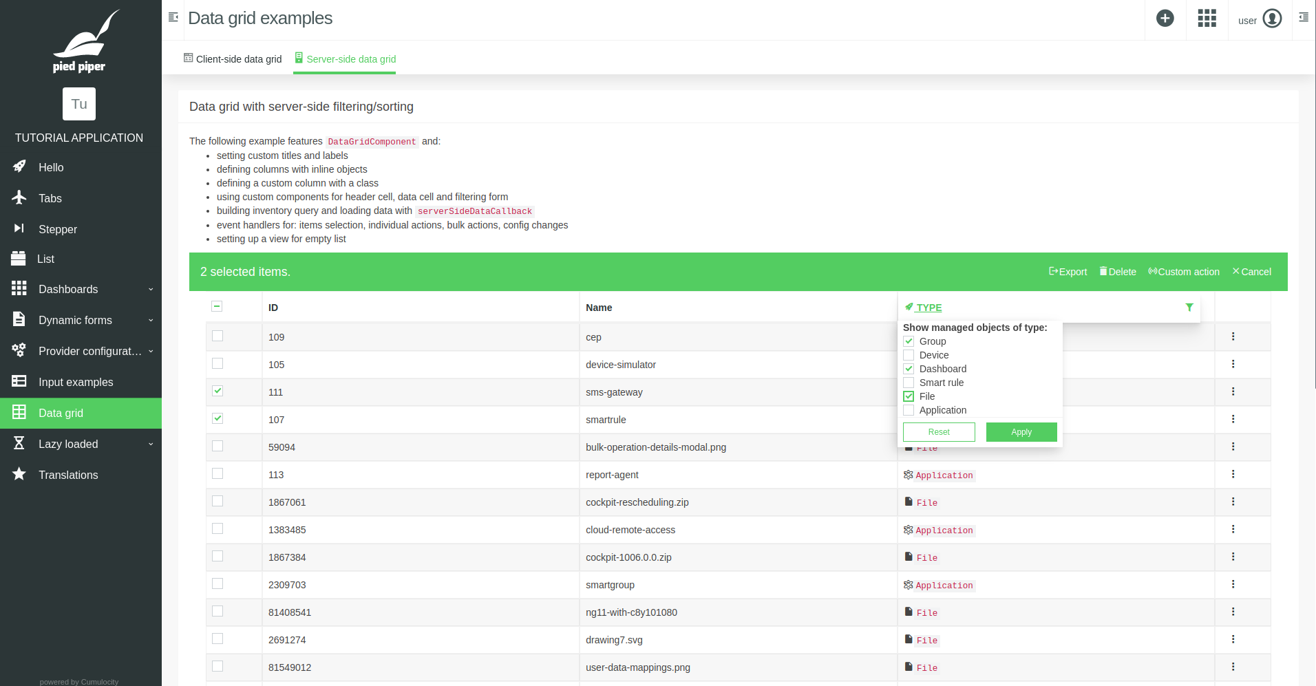
TypeFilteringFormRendererComponent renders the filtering form for the column where filtering options can be selected and applied or reset:
import { Component, Inject } from '@angular/core';
import { FilteringFormRendererContext } from '@c8y/ngx-components';
import { ServerGridExampleService, TypeFilteringModel } from '../server-grid-example.service';

/**
 * This is the example component for custom filtering form.
 * The form can contain any inputs you want.
 * The important thing is to invoke one of the 2 methods:
 *
 * - `applyFilter` which sets `filterPredicate` or `externalFilterQuery` in the column,
 *   these values will later be used to generate the query
 * - `resetFilter` which resets filter settings in the column
 *
 * Our example shows the list of checkboxes. Selecting them modifies the query being sent.
 */
@Component({
  template: `
    <form #filterForm="ngForm">
      <strong>Show managed objects of type:</strong>
      <c8y-form-group class="m-b-0">
        <label class="c8y-checkbox">
          <input type="checkbox" name="group" [(ngModel)]="model.group" />
          <span></span>
          <span>Group</span>
        </label>
      </c8y-form-group>
      <c8y-form-group class="m-b-0">
        <label class="c8y-checkbox">
          <input type="checkbox" name="device" [(ngModel)]="model.device" />
          <span></span>
          <span>Device</span>
        </label>
      </c8y-form-group>
      <c8y-form-group class="m-b-0">
        <label class="c8y-checkbox">
          <input type="checkbox" name="dashboard" [(ngModel)]="model.dashboard" />
          <span></span>
          <span>Dashboard</span>
        </label>
      </c8y-form-group>
      <c8y-form-group class="m-b-0">
        <label class="c8y-checkbox">
          <input type="checkbox" name="smartRule" [(ngModel)]="model.smartRule" />
          <span></span>
          <span>Smart rule</span>
        </label>
      </c8y-form-group>
      <c8y-form-group class="m-b-0">
        <label class="c8y-checkbox">
          <input type="checkbox" name="file" [(ngModel)]="model.file" />
          <span></span>
          <span>File</span>
        </label>
      </c8y-form-group>
      <c8y-form-group class="m-b-0">
        <label class="c8y-checkbox">
          <input type="checkbox" name="application" [(ngModel)]="model.application" />
          <span></span>
          <span>Application</span>
        </label>
      </c8y-form-group>
    </form>

    <div class="data-grid__dropdown__footer d-flex separator-top">
      <button class="btn btn-default btn-sm m-r-8 flex-grow" (click)="resetFilter()">Reset</button>
      <button
        class="btn btn-primary btn-sm flex-grow"
        [disabled]="filterForm.invalid"
        (click)="applyFilter()"
      >
        Apply
      </button>
    </div>
  `
})
export class TypeFilteringFormRendererComponent {
  model: TypeFilteringModel;

  constructor(
    public context: FilteringFormRendererContext,
    @Inject(ServerGridExampleService) public service: ServerGridExampleService
  ) {
    // restores the settings from current column setup
    this.model = (this.context.property.externalFilterQuery || {}).model || {};
  }

  /**
   * Applies the filter.
   * Sets `externalFilterQuery.model` to restore the same settings the next time the form is displayed.
   * Sets `externalFilterQuery.query` to pass the query object to be included in the final data grid query.
   */
  applyFilter() {
    this.context.applyFilter({
      externalFilterQuery: {
        model: this.model,
        query: this.service.getTypeQuery(this.model)
      }
    });
  }

  /** Restes the filter, just call the method from context. */
  resetFilter() {
    this.context.resetFilter();
  }
}
Later it will be presented how to use externalFilterQuery to build a query to fetch data from the server.
Rows
Rows can be provided to the data grid via rows input. However, this is usually only useful for predefined set of data which is then processed on the client side. If you want to know more about this way of providing data, see the example in our tutorial application.
Another way of providing data to the data grid is to use serverSideDataCallback input. The function provided to this input will be invoked whenever the grid needs to load data, i.e. on initial load, on next page load, on column filtering or sorting settings change. This function should take a DataSourceModifier object and return a ServerSideDataResult object. The modifier represents the current state of the grid, i.e. filtering/sorting settings in columns, search text from the search input, selected items and pagination. Based on this state, you can perform any logic you need to determine what data should be displayed and then return it, along with additional statistics needed for accurate handling of the paging:
size: the number of all items that can be displayed in a grid when no filters are appliedfilteredSize: the number of items that match current filters
Let's consider the following example:
Example :/**
* This method loads data when data grid requests it (e.g. on initial load or on column settings change).
* It gets the object with current data grid setup and is supposed to return:
* full response, list of items, paging object, the number of items in the filtered subset, the number of all items.
*/
async onDataSourceModifier(
dataSourceModifier: DataSourceModifier
): Promise<ServerSideDataResult> {
let serverSideDataResult: ServerSideDataResult;
const { res, data, paging } = await this.service.getData(
dataSourceModifier.columns,
dataSourceModifier.pagination
);
const filteredSize: number = await this.service.getCount(
dataSourceModifier.columns,
dataSourceModifier.pagination
);
const size: number = await this.service.getTotal();
serverSideDataResult = { res, data, paging, filteredSize, size };
return serverSideDataResult;
}As you can see, we're using the state from dataSourceModifier to execute the queries and return the result. The actual implementation of these 3 queries might vary depending on your use case (what endpoint is used, what kind of columns you defined, etc.). In the following example we'll build and execute inventory queries based on columns with standard and custom filtering/sorting settings and pagination:
/** Returns data for current columns and pagination setup. */
async getData(columns: Column[], pagination: Pagination) {
  // build filters based on columns and pagination
  const filters = this.getFilters(columns, pagination);
  // execute inventory query for the list of managed objects
  return this.inventoryService.list(filters);
}

/** Returns the number of items matching current columns and pagination setup. */
async getCount(columns: Column[], pagination: Pagination) {
  const filters = {
    // build filters based on columns and pagination
    ...this.getFilters(columns, pagination),
    // but we only need the number of items, not the items themselves
    pageSize: 1,
    currentPage: 1
  };
  return (await this.inventoryService.list(filters)).paging.totalPages;
}

/** Returns the total number of items (with no filters). */
async getTotal(): Promise<number> {
  const filters = {
    pageSize: 1,
    withTotalPages: true
  };
  return (await this.inventoryService.list(filters)).paging.totalPages;
}
Two of the functions above use getFilters method to build a query based on the columns and pagination setup:
/** Returns filters for given columns and pagination setup. */
private getFilters(columns: Column[], pagination: Pagination) {
  return {
    query: this.getQueryString(columns),
    pageSize: pagination.pageSize,
    currentPage: pagination.currentPage,
    withChildren: false,
    withTotalPages: true
  };
}

/** Returns a query string based on columns setup. */
private getQueryString(columns: Column[]): string {
  const fullQuery = this.getQueryObj(columns);
  return this.queriesUtil.buildQuery(fullQuery);
}

/** Returns a query object based on columns setup. */
private getQueryObj(columns: Column[]): any {
  return transform(columns, (query, column) => this.addColumnQuery(query, column), {
    __filter: {},
    __orderby: []
  });
}

/** Extends given query with a part based on the setup of given column. */
private addColumnQuery(query: any, column: Column): void {
  // when a column is marked as filterable
  if (column.filterable) {
    // in the case of default filtering form, `filterPredicate` will contain the string entered by a user
    if (column.filterPredicate) {
      // so we use it as the expected value, * allow to search for it anywhere in the property
      query.__filter[column.path] = `*${column.filterPredicate}*`;
    }

    // in the case of custom filtering form, we're storing the query in `externalFilterQuery.query`
    if (column.externalFilterQuery) {
      query = this.queriesUtil.addAndFilter(query, column.externalFilterQuery.query);
    }
  }

  // when a column is sortable and has a specified sorting order
  if (column.sortable && column.sortOrder) {
    // add sorting condition for the configured column `path`
    query.__orderby.push({
      [column.path]: column.sortOrder === 'asc' ? 1 : -1
    });
  }

  return query;
}
You can see the above example working in our tutorial application:
Row actions
The component supports actions to be invoked on individual rows or bulk actions to be invoked on multiple rows previously selected by user. You can either use predefined actions or define your own:
Example :actionControls: ActionControl[] = [
{ type: BuiltInActionType.Edit, callback: (item) => console.dir(item) },
{ type: BuiltInActionType.Export, callback: (item) => console.dir(item) },
{ type: BuiltInActionType.Delete, callback: (item) => console.dir(item) },
{
type: 'customAction',
icon: 'online',
text: 'Custom action',
callback: (item) => console.dir(item)
}
];
bulkActionControls: BulkActionControl[] = [
{
type: BuiltInActionType.Export,
callback: (selectedItemIds) => console.dir(selectedItemIds)
},
{
type: BuiltInActionType.Delete,
callback: (selectedItemIds) => console.dir(selectedItemIds)
},
{
type: 'customAction',
icon: 'online',
text: 'Custom action',
callback: (selectedItemIds) => console.dir(selectedItemIds)
}
];Infinite scroll / "Load more" button
The component takes infiniteScroll input which can have one of the following values:
auto: attempts to load more data automatically as user scrolls down (default)show: shows a load more button for the user to decidenone: doesn't perform any load more actionhidden: loads more data automatically but with no visible button for the user
Event emitters
The component exposes several event emitter outputs:
itemsSelectonChildDevicesonConfigChangeonFilterrowClickrowMouseLeaverowMouseOver
to which you can bind via template, e.g.:
Example :<c8y-data-grid
(rowClick)="onRowClick($event)"
(itemsSelect)="onItemsSelect($event)"
(onConfigChange)="onConfigChange($event)"
></c8y-data-grid>See more details about them in the outputs reference.
@let loadingData = ((dataSource.loading$ | async) && !loadMoreComponent?.isLoading) || loading;
<div
class="table-data-grid-scroll"
#scroll
[ngClass]="{
'table-data-grid__overlay': loadingData
}"
data-cy="c8y-data-grid--table-data-grid-scroll"
>
@if (loadingData && displayOptions.showLoadingIndicator) {
<div class="table-data-grid__loading--wrapper">
<div class="table-data-grid__loading--loader">
<c8y-loading
layout="application"
[message]="loadingItemsLabel"
></c8y-loading>
</div>
</div>
}
@if (displayOptions.gridHeader) {
<div class="table-data-grid-header separator large-padding">
<div
class="h4"
[ngClass]="{ 'm-r-16': !!title }"
>
{{ title | translate }}
</div>
@if (displayOptions.filter) {
@if (!filteringApplied) {
<span>
@if (!!filteringLabelsParams.allItemsCount) {
<small
class="m-r-4"
ngNonBindable
translate
[translateParams]="filteringLabelsParams"
>
{{ filteredItemsCount }} of {{ allItemsCount }} items
</small>
}
<span
class="label label-default m-r-4"
translate
>
No filters
</span>
</span>
}
@if (filteringApplied) {
<span class="d-flex a-i-center">
@if (!!filteringLabelsParams.allItemsCount) {
<div class="a-i-center">
<span class="badge badge-info m-r-4">
{{ (dataSource.stats$ | async).filteredSize }}
</span>
<small
ngNonBindable
translate
[translateParams]="filteringLabelsParams"
>
of {{ allItemsCount }} items
</small>
</div>
}
<div
class="dropdown"
placement="bottom left"
dropdown
#ddFilters="bs-dropdown"
[cdkTrapFocus]="ddFilters.isOpen"
[insideClick]="true"
>
<button
class="btn btn-default btn-sm m-l-8"
title="{{ 'Active filters' | translate }}"
aria-haspopup="true"
dropdownToggle
data-cy="c8y-data-grid--filters"
>
<i
class="m-r-4"
c8yIcon="filter"
></i>
<span>{{ 'Active filters' | translate }}</span>
<span
class="badge badge-system"
data-cy="c8y-data-grid--filters-count"
>
{{ columnsWithFiltersApplied.length }}
</span>
</button>
<div
class="dropdown-menu"
*dropdownMenu
(click)="$event.stopPropagation()"
>
<div class="data-grid__dropdown bg-level-0">
<ul class="list-unstyled m-0">
@for (column of columnsWithFiltersApplied; track $index; let last = $last) {
<li [ngClass]="{ 'separator-bottom': !last }">
<ng-container>
<div
class="dropdown-header sticky-top text-truncate no-border-top p-b-0"
title="{{ (column.header | translate) || column.name }}"
>
<label>
{{ (column.header | translate) || column.name }}
</label>
</div>
@for (
groupedFilterChips of column
| mapToFilterChips
| async
| groupedFilterChips;
track $index;
let first = $first
) {
<div
class="list-group-item borderless d-flex d-col"
[ngClass]="{ 'p-t-0': first }"
>
@if (groupedFilterChips.label) {
<p class="small p-b-4">
{{ groupedFilterChips.label | translate }}
</p>
}
<div class="d-flex a-i-center gap-4 flex-wrap">
@for (chip of groupedFilterChips.chips; track $index) {
<span class="tag tag--info chip">
<button
class="btn btn-xs btn-clean text-10 m-r-4"
title="{{ 'Remove filter' | translate }}"
(click)="removeFilter(chip.remove())"
data-cy="c8y-data-grid--remove-chip"
>
<i c8yIcon="times"></i>
</button>
{{ chip.displayValue | translate }}
</span>
}
</div>
</div>
}
</ng-container>
</li>
}
</ul>
</div>
<div class="list-group-item separator-top sticky-bottom">
<button
class="btn btn-sm btn-default"
title="{{ 'Clear all filters' | translate }}"
type="button"
(click)="clearFilters()"
data-cy="c8y-data-grid--clear-filters"
>
{{ 'Clear all filters' | translate }}
</button>
</div>
</div>
</div>
</span>
}
@if (displayOptions.filter) {
<button
class="btn-help btn-help--sm hidden-xs hidden-sm"
[attr.aria-label]="'Help' | translate"
[popover]="filtersHelpPopover"
placement="right"
triggers="focus"
type="button"
data-cy="data-grid--help-filters"
>
<i c8yIcon="question-circle-o"></i>
</button>
}
<ng-template #filtersHelpPopover>
<div [innerHtml]="filtersHelpPopoverHtml | translate"></div>
</ng-template>
@if (showCounterWarning) {
<button
class="btn-clean text-primary hidden-xs hidden-sm"
[attr.aria-label]="'Help' | translate"
popover="{{
'The counter for the total number of items might be inaccurate.' | translate
}}"
placement="right"
triggers="focus"
type="button"
>
<i c8yIcon="warning"></i>
</button>
}
}
<div class="m-l-auto">
<div class="btnbar d-flex a-i-center">
@for (
headerActionControl of headerActionControls | visibleControls | async;
track $index
) {
<ng-container>
@if (!headerActionControl.template) {
<button
class="btnbar-btn btn-link"
title="{{ headerActionControl.text | translate }}"
type="button"
(click)="headerActionControl.callback()"
c8yProductExperience
inherit
[actionData]="{
action: PX_ACTIONS.CUSTOM_ACTION,
customActionName: headerActionControl.text,
type: headerActionControl.type
}"
>
<i
class="m-r-4"
[c8yIcon]="headerActionControl.icon"
></i>
<span>{{ headerActionControl.text | translate }}</span>
</button>
} @else {
<ng-container
*ngTemplateOutlet="
headerActionControl.template;
context: { headerActionControl: headerActionControl }
"
></ng-container>
}
</ng-container>
}
@if (configureColumnsEnabled) {
<div
class="dropdown"
placement="bottom left"
dropdown
#ddConfigureColumns="bs-dropdown"
[cdkTrapFocus]="ddConfigureColumns.isOpen"
[insideClick]="true"
>
<button
class="btnbar-btn"
title="{{ 'Configure columns' | translate }}"
type="button"
data-cy="data-grid--custom-column-btn"
dropdownToggle
>
<i
class="m-r-4"
c8yIcon="columns"
></i>
<span>{{ 'Configure columns' | translate }}</span>
</button>
<ul
class="dropdown-menu data-grid__dropdown"
*dropdownMenu
(click)="$event.stopPropagation()"
>
<li>
<div
class="list-group m-0"
cdkDropList
(cdkDropListDropped)="onColumnDrop($event)"
>
@for (column of columns; track $index) {
<div
cdkDrag
cdkDragLockAxis="y"
>
@if (!column.positionFixed) {
<div class="list-group-item draggable-after p-l-16 p-r-16 a-i-center">
<label
class="c8y-checkbox min-width-0"
title="{{ column.custom ? ('Custom' | translate) + ' ' : '' }}{{
(column.header | translate) || column.name
}}"
[attr.data-cy]="'data-grid--custom-column-header-' + column.header"
>
<input
type="checkbox"
[(ngModel)]="column.visible"
(change)="
updateGridColumnsSize();
emitConfigChange('changeColumnVisibility')
"
c8yProductExperience
inherit
[actionData]="{
action: PX_ACTIONS.CHANGE_VISIBILITY,
column: column.name,
visible: !column.visible
}"
/>
<span></span>
<div class="d-col min-width-0 m-l-8 m-r-8">
@if (column?.custom) {
<span class="text-muted text-10 m-b-0">
{{ 'Custom' | translate }}
</span>
}
<span class="text-truncate l-h-1 m-t-2">
{{ (column.header | translate) || column.name }}
</span>
</div>
@let canRetrieve = canRetrieveAssetProperties | async;
@if (canRetrieve) {
@if (canRetrieve && column?.type) {
<span
class="tag tag--default a-s-end"
title="{{ column.type | translate | humanize }}"
>
{{ column.type | translate | humanize }}
</span>
}
}
</label>
@if (column.custom) {
<button
class="btn btn-dot btn-dot--danger showOnHover max-width-fit a-i-center"
[attr.aria-label]="'Remove`column,verb`' | translate"
[popover]="confirmRemovePopover"
type="button"
#pop="bs-popover"
(click)="
currentRemoveCustomColumnPopover !== pop &&
currentRemoveCustomColumnPopover?.hide();
currentRemoveCustomColumnPopover = pop
"
>
<i
c8yIcon="minus-circle"
data-cy="data-grid--custom-column-remove-btn"
></i>
</button>
<ng-template #confirmRemovePopover>
<h3 class="popover-title popover-header">
{{ 'Confirm removal' | translate }}
</h3>
<div class="popover-content popover-body">
<p>{{ 'Do you want to remove this column?' | translate }}</p>
<div class="popover-footer gap-16">
<button
class="btn btn-default btn-sm"
type="button"
(click)="pop.hide()"
>
{{ 'Cancel' | translate }}
</button>
<button
class="btn btn-danger btn-sm"
type="button"
(click)="confirmRemoveColumn(column); pop.hide()"
data-cy="popover-confirm--Remove"
>
{{ 'Remove' | translate }}
</button>
</div>
</div>
</ng-template>
}
</div>
}
</div>
}
</div>
</li>
@if (isConfigContextKnown) {
<li class="p-8 sticky-bottom separator-top">
<button
class="btn btn-default btn-block"
title="{{ 'Add custom column' | translate }}"
type="button"
data-cy="data-grid--add-custom-column"
(click)="openCustomColumn(); ddConfigureColumns.hide()"
>
<i
class="m-r-4"
c8yIcon="plus-circle"
></i>
<span>{{ 'Add custom column' | translate }}</span>
</button>
</li>
}
</ul>
</div>
}
@if (!hideReload) {
<button
class="btnbar-btn btn-link"
title="{{ 'Reload' | translate }}"
type="button"
data-cy="data-grid--reload-btn"
[disabled]="dataSource.loading$ | async"
(click)="clickReload()"
>
<i
class="m-r-4"
c8yIcon="refresh"
></i>
<span>{{ 'Reload' | translate }}</span>
</button>
}
@if (!serverSideDataCallback || showSearch) {
<div class="input-group input-group-search m-l-sm-16 data-grid__search-input">
<input
class="form-control"
placeholder="{{ 'Search…' | translate }}"
type="search"
[(ngModel)]="searchText"
(ngModelChange)="searchText$.emit($event)"
(keydown.enter)="$event.stopPropagation(); performSearch(searchText)"
/>
<div class="input-group-addon">
@if (searchText.length === 0) {
<i c8yIcon="search"></i>
}
@if (searchText.length > 0) {
<i
class="pointer"
c8yIcon="times"
(click)="searchText = ''; searchText$.emit('')"
c8yProductExperience
inherit
[actionData]="{ action: PX_ACTIONS.CLEAR_SEARCH }"
></i>
}
</div>
</div>
}
</div>
</div>
@if (selectedItemIds.length !== 0) {
<div
class="table-data-grid-header-bulk-actions animated slideInDown fast"
data-cy="table-data-grid-header-bulk-actions"
>
<h4>
<ng-container [ngPlural]="selectedItemIds.length">
<ng-template ngPluralCase="=1">
<span translate>1 selected item.</span>
</ng-template>
<ng-template ngPluralCase="other">
<span
ngNonBindable
translate
[translateParams]="{ count: selectedItemIds.length }"
>
{{ count }} selected items.
</span>
</ng-template>
</ng-container>
<br class="visible-xs" />
@if (!serverSideDataCallback && selectedItemIds.length >= pagination.pageSize) {
<small>
<a
class="interact"
(click)="setAllItemsSelected(true)"
c8yProductExperience
inherit
[actionData]="{ action: PX_ACTIONS.SELECT_ALL_ITEMS }"
>
<span
ngNonBindable
translate
[translateParams]="{ count: (dataSource.stats$ | async).filteredSize }"
>
Select all {{ count }} items
</span>
</a>
</small>
}
</h4>
<div class="m-l-auto">
<div class="btnbar d-flex">
@for (
bulkActionControl of bulkActionControls | visibleControls: selectedItemIds | async;
track $index
) {
<ng-container>
@switch (bulkActionControl.type) {
@case (builtInActionType.Export) {
<button
class="btnbar-btn"
title="{{ 'Export' | translate }}"
type="button"
(click)="bulkActionControl.callback(selectedItemIds, reload.bind(this))"
[actionData]="{ action: PX_ACTIONS.BULK_EXPORT }"
c8yProductExperience
inherit
>
<i c8yIcon="sign-out"></i>
<span>{{ 'Export' | translate }}</span>
</button>
}
@case (builtInActionType.Delete) {
<button
class="btnbar-btn"
title="{{ 'Delete' | translate }}"
type="button"
(click)="bulkActionControl.callback(selectedItemIds, reload.bind(this))"
[actionData]="{ action: PX_ACTIONS.BULK_DELETE }"
c8yProductExperience
inherit
>
<i c8yIcon="delete"></i>
<span>{{ 'Delete' | translate }}</span>
</button>
}
@default {
<button
class="btnbar-btn"
title="{{ bulkActionControl.text | translate }}"
type="button"
(click)="bulkActionControl.callback(selectedItemIds, reload.bind(this))"
[actionData]="{
action: PX_ACTIONS.BULK_CUSTOM_ACTION,
customActionName: bulkActionControl.text
}"
c8yProductExperience
inherit
>
<i
[class]="bulkActionControl.iconClasses"
c8yIcon="{{ bulkActionControl.icon }}"
></i>
<span>{{ bulkActionControl.text | translate }}</span>
</button>
}
}
</ng-container>
}
<button
class="btnbar-btn"
title="{{ 'Cancel' | translate }}"
type="button"
(click)="cancel()"
[actionData]="{
action: PX_ACTIONS.BULK_CANCEL
}"
c8yProductExperience
inherit
>
<i c8yIcon="times"></i>
<span>{{ 'Cancel' | translate }}</span>
</button>
</div>
</div>
</div>
}
</div>
}
<table
class="table table-filtered-sorted table-data-grid large-padding"
[class.table-striped]="displayOptions.striped && !treeGrid"
[class.table-bordered]="displayOptions.bordered"
[class.table-hover]="displayOptions.hover"
[class.table-data-grid-with-checkboxes]="selectable"
[class.table-data-grid-with-actions]="actionControls.length > 0"
[style.grid-template-columns]="styles.gridTemplateColumns"
cdk-table
[dataSource]="dataSource"
[multiTemplateDataRows]="true"
(mousemove)="resizeHandleContainerMouseMove$.emit($event)"
data-cy="c8y-data-grid--table"
>
@for (column of columns; track column.name; let i = $index) {
<ng-container [cdkColumnDef]="column.name">
@switch (column.name) {
@case ('checkbox') {
<th
cdk-header-cell
*cdkHeaderCellDef
data-type="icon"
>
<div>
<label class="c8y-checkbox">
<input
[attr.aria-label]="'Selected' | translate"
type="checkbox"
[checked]="currentPageSelectionState.allSelected"
[indeterminate]="
!(
currentPageSelectionState.allSelected ||
currentPageSelectionState.allDeselected
)
"
(change)="setAllItemsInCurrentPageSelected($event.target.checked)"
c8yProductExperience
inherit
[actionData]="{ action: PX_ACTIONS.SELECT_ALL_ITEMS }"
/>
<span></span>
</label>
</div>
</th>
<td
cdk-cell
*cdkCellDef="let row"
data-type="icon"
>
<label class="c8y-checkbox">
<input
[attr.aria-label]="'Selected' | translate"
type="checkbox"
[checked]="isItemSelected(row)"
(change)="setItemsSelected([row], $event.target.checked)"
c8yProductExperience
inherit
[actionData]="{
action: PX_ACTIONS.SELECT_ITEM,
id: row.id
}"
data-cy="c8y-data-grid--checkbox"
/>
<span></span>
</label>
</td>
}
@case ('radio-button') {
<th
cdk-header-cell
*cdkHeaderCellDef
data-type="icon"
></th>
<td
cdk-cell
*cdkCellDef="let row"
data-type="icon"
>
<label class="c8y-radio">
<input
[attr.aria-label]="'Selected' | translate"
name="select-row"
type="radio"
[checked]="isItemSelected(row)"
(change)="changeSelectedItem(row)"
c8yProductExperience
inherit
[actionData]="{
action: PX_ACTIONS.SELECT_ITEM,
id: row.id
}"
data-cy="c8y-data-grid--radio"
/>
<span></span>
</label>
</td>
}
@case ('actions') {
<th
cdk-header-cell
*cdkHeaderCellDef
data-type="icon"
>
<p class="text-medium sr-only">{{ 'Actions' | translate }}</p>
</th>
<td
cdk-cell
*cdkCellDef="let row"
data-type="icon"
>
@for (
actionControl of actionControls
| visibleControls: row
| async
| slice
: 0
: ((actionControls | visibleControls: row | async)?.length > 2 ? 1 : 2);
track $index
) {
<ng-container>
@switch (actionControl.type) {
@case (builtInActionType.Edit) {
<button
class="btn btn-dot"
[attr.aria-label]="'Edit' | translate"
tooltip="{{ 'Edit' | translate }}"
container="body"
type="button"
[delay]="500"
(click)="actionControl.callback(row, reload.bind(this))"
c8yProductExperience
inherit
[actionData]="{
action: PX_ACTIONS.EDIT_ITEM,
id: row.id
}"
data-cy="c8y-data-grid--edit-button-in-row"
>
<i c8yIcon="pencil"></i>
</button>
}
@case (builtInActionType.Delete) {
<button
class="btn btn-dot btn-dot--danger showOnHover"
[attr.aria-label]="'Delete' | translate"
tooltip="{{ 'Delete' | translate }}"
container="body"
type="button"
[delay]="500"
(click)="actionControl.callback(row, reload.bind(this))"
[actionData]="{
action: PX_ACTIONS.DELETE_ITEM,
id: row.id
}"
c8yProductExperience
inherit
data-cy="c8y-data-grid--remove-button-in-row"
>
<i c8yIcon="delete"></i>
</button>
}
@default {
<button
class="btn btn-dot"
[attr.aria-label]="
(actionControl.icon ? actionControl.text : '') | translate
"
tooltip="{{ (actionControl.icon ? actionControl.text : '') | translate }}"
container="body"
type="button"
[ngClass]="{ showOnHover: actionControl.showOnHover }"
[delay]="500"
(click)="actionControl.callback(row, reload.bind(this))"
[actionData]="{
action: PX_ACTIONS.CUSTOM_ACTION_ITEM,
customActionName: actionControl.text,
id: row.id
}"
c8yProductExperience
inherit
[attr.data-cy]="'c8y-data-grid--button-in-row--' + actionControl.text"
>
@if (actionControl.icon) {
<i
c8yIcon="{{ actionControl.icon }}"
[ngClass]="actionControl.iconClasses"
></i>
} @else {
<span>{{ actionControl.text | translate }}</span>
}
</button>
}
}
</ng-container>
}
<div
[ngClass]="{
'm-l-auto overflow-visible':
(actionControls | visibleControls: row | async)?.length > 2
}"
>
@if ((actionControls | visibleControls: row | async)?.length > 2) {
<div
class="dropdown"
placement="bottom right"
container="body"
dropdown
>
<button
class="dropdown-toggle c8y-dropdown"
title="{{ 'Actions' | translate }}"
aria-haspopup="true"
type="button"
data-cy="c8y-data-grid--row-actions-dropdown"
dropdownToggle
>
<i c8yIcon="ellipsis-v"></i>
</button>
<ul
class="dropdown-menu dropdown-menu-right"
*dropdownMenu
>
@for (
actionControl of actionControls
| visibleControls: row
| async
| slice
: ((actionControls | visibleControls: row | async)?.length > 2 ? 1 : 2);
track $index
) {
<li>
@switch (actionControl.type) {
@case (builtInActionType.Edit) {
<button
title="{{ 'Edit' | translate }}"
type="button"
(click)="actionControl.callback(row, reload.bind(this))"
[actionData]="{
action: PX_ACTIONS.EDIT_ITEM,
id: row.id
}"
c8yProductExperience
inherit
>
<i c8yIcon="pencil"></i>
{{ 'Edit' | translate }}
</button>
}
@case (builtInActionType.Delete) {
<button
title="{{ 'Delete' | translate }}"
type="button"
(click)="actionControl.callback(row, reload.bind(this))"
[actionData]="{
action: PX_ACTIONS.DELETE_ITEM,
id: row.id
}"
c8yProductExperience
inherit
>
<i c8yIcon="delete"></i>
{{ 'Delete' | translate }}
</button>
}
@case (builtInActionType.Export) {
<button
title="{{ 'Export' | translate }}"
type="button"
(click)="actionControl.callback(row, reload.bind(this))"
[actionData]="{
action: PX_ACTIONS.EXPORT_ITEM,
id: row.id
}"
c8yProductExperience
inherit
>
<i c8yIcon="data-export"></i>
{{ 'Export' | translate }}
</button>
}
@default {
<button
title="{{ actionControl.text | translate }}"
type="button"
(click)="actionControl.callback(row, reload.bind(this))"
c8yProductExperience
inherit
[actionData]="{
action: PX_ACTIONS.CUSTOM_ACTION_ITEM,
customActionName: actionControl.text,
id: row.id
}"
>
<i
c8yIcon="{{ actionControl.icon }}"
[ngClass]="actionControl.iconClasses"
></i>
{{ actionControl.text | translate }}
</button>
}
}
</li>
}
</ul>
</div>
}
</div>
</td>
}
@default {
<th
[class.sorted]="column.sortOrder"
[class.filtered]="column | map: isColumnFilteringApplied"
[class.hidden]="!column.visible"
cdk-header-cell
*cdkHeaderCellDef
[ngClass]="column.headerCSSClassName"
[attr.data-type]="column.dataType"
>
@if (!column.filterable) {
<div [title]="(column.header | translate) || column.name">
@let cellRendererSpec =
[
{
columnName: column.name,
value: (column.header | translate) || column.name
}
] | map: getHeaderCellRendererSpec : this;
@if (cellRendererSpec) {
<c8y-cell-renderer [spec]="cellRendererSpec"></c8y-cell-renderer>
}
</div>
}
<!-- isDropDownPlacedRight to be removed when columns are transformed to observables. -->
@if (column.filterable) {
<div
class="dropdown"
placement="bottom {{ isDropDownPlacedRight(column) ? 'right' : 'left' }}"
dropdown
#gridHeaderDropdown="bs-dropdown"
[cdkTrapFocus]="gridHeaderDropdown.isOpen"
[insideClick]="true"
>
<button
class="btn-header"
[title]="(column.header | translate) || column.name"
type="button"
[attr.data-cy]="'data-grid--header-btn--' + column.header"
dropdownToggle
>
@let cellRendererSpec =
[
{
columnName: column.name,
value: (column.header | translate) || column.name
}
] | map: getHeaderCellRendererSpec : this;
@if (cellRendererSpec) {
<c8y-cell-renderer
data-cy="c8y-data-grid--c8y-cell-renderer"
[spec]="cellRendererSpec"
></c8y-cell-renderer>
}
<i
c8yIcon="filter"
title="{{ 'Filter' | translate }}"
></i>
</button>
<!-- isDropDownPlacedRight to be removed when columns are transformed to observables. -->
<ul
class="dropdown-menu"
*dropdownMenu
[ngClass]="{ 'dropdown-menu-right-grid': isDropDownPlacedRight(column) }"
(click)="$event.stopPropagation()"
>
<li class="data-grid__dropdown">
@let filteringFormRendererSpec =
[
{
column: column,
dropdown: gridHeaderDropdown
}
] | map: getFilteringFormRendererSpec : this;
@if (filteringFormRendererSpec) {
<c8y-filtering-form-renderer
class="bg-component"
[spec]="filteringFormRendererSpec"
data-cy="c8y-data-grid--c8y-filtering-form-renderer"
></c8y-filtering-form-renderer>
}
</li>
</ul>
</div>
}
@if (column.sortable) {
<button
class="btn-sort"
[style]="{
'margin-left': !column.filterable && column.sortable ? '-20px' : null
}"
[title]="sortColumnTitle | translate: { name: column.header | translate }"
type="button"
(click)="changeSortOrder(column.name)"
data-cy="change-sort-order"
>
@switch (column.sortOrder) {
@case ('asc') {
<i c8yIcon="long-arrow-up"></i>
}
@case ('desc') {
<i c8yIcon="long-arrow-down"></i>
}
@default {
<i c8yIcon="exchange"></i>
}
}
</button>
}
@if (column.resizable) {
<span
class="resize-handle"
(mousedown)="
resizeHandleMouseDown$.emit({ event: $event, targetColumnName: column.name })
"
></span>
}
</th>
<td
[class.hidden]="!column.visible"
[attr.data-cell-title]="column.header | translate"
cdk-cell
*cdkCellDef="let row"
[ngClass]="column.cellCSSClassName"
[attr.data-cy]="'data-grid--' + column.header"
[attr.data-type]="column.dataType"
>
@let cellRendererSpec =
[
{
value: resolveCellValue(row, column.path),
row: row,
columnName: column.name
}
] | map: getCellRendererSpec : this;
@if (cellRendererSpec) {
<c8y-cell-renderer [spec]="cellRendererSpec"></c8y-cell-renderer>
}
</td>
}
}
</ng-container>
}
<ng-container cdkColumnDef="infiniteScrollFooter">
<td
[style.grid-column]="styles.gridInfiniteScrollColumn"
cdk-footer-cell
*cdkFooterCellDef
>
<template #infiniteScrollContainer></template>
</td>
</ng-container>
<tr
cdk-header-row
*cdkHeaderRowDef="columnNames"
></tr>
<tr
data-cy="c8y-data-grid--row-in-data-grid"
cdk-row
*cdkRowDef="let row; columns: columnNames; let idx = dataIndex; when: isDataRow"
[ngClass]="[
activeClassName && row === lastClickedRow ? activeClassName : '',
idx % 2 === 0 ? 'even' : 'odd',
row.level > 0 ? 'data-grid-child-node level-' + row.level : ''
]"
(mouseover)="rowMouseOver.emit(row)"
(mouseleave)="rowMouseLeave.emit(row)"
(click)="handleClick(row)"
></tr>
<tr
class="expanded-row"
[ngClass]="{ hidden: !(expandedRows.get(row).visible$ | async) }"
data-cy="c8y-data-grid--expanded-row-in-data-grid"
cdk-row
*cdkRowDef="let row; columns: ['expanded-row']; when: isRowExpanded"
></tr>
<ng-container cdkColumnDef="expanded-row">
<td
[style.grid-column]="styles.gridInfiniteScrollColumn"
cdk-cell
*cdkCellDef="let row"
>
<ng-container
*ngTemplateOutlet="
expandableRow?.template;
context: {
$implicit: row,
asyncRenderSuccess: setExpandableRowVisible.bind(this, row, true),
asyncRenderFail: setExpandableRowVisible.bind(this, row, false)
}
"
></ng-container>
</td>
</ng-container>
<tr
[class]="'pagination-row level-' + (row.parentRow.level + 1)"
cdk-row
*cdkRowDef="let row; columns: ['pagination-row']; when: isPaginationRow"
></tr>
<ng-container cdkColumnDef="pagination-row">
<td
[style.grid-column]="styles.gridInfiniteScrollColumn"
cdk-cell
*cdkCellDef="let row"
>
<div class="col-sm-4 no-gutter">
@if ((dataSource.stats$ | async).currentPageSize > 0) {
<div
class="counter p-t-8 p-b-8"
data-cy="data-grid--child-counter"
>
<span
class="text-muted"
ngNonBindable
translate
[translateParams]="{
pageFirstItemIdx:
(row.childrenStats.currentPage - 1) * row.childrenStats.firstPageSize + 1,
pageLastItemIdx:
(row.childrenStats.currentPage - 1) * row.childrenStats.firstPageSize +
1 +
(row.childrenStats.currentPageSize - 1),
itemsTotal: row.childrenStats.filteredSize
}"
>
{{ pageFirstItemIdx }} - {{ pageLastItemIdx }} of {{ itemsTotal }}
</span>
<span class="text-muted text-12 m-r-4">{{ 'Parent node' | translate }}</span>
<span class="tag tag--default">{{ row.parentRow?.[parentNodeLabelProperty] }}</span>
</div>
}
</div>
<div class="col-sm-4 col-sm-offset-4 no-gutter text-right">
@if (row.childrenStats.filteredSize > row.childrenStats.currentPageSize) {
<pagination
class="d-flex j-c-end"
[ngModel]="row.childrenStats.currentPage"
(pageChanged)="updateChildPagination($event, row)"
[totalItems]="row.childrenStats.filteredSize"
[itemsPerPage]="row?.parentRow?.pagination?.pageSize ?? childNodePagination.pageSize"
[maxSize]="5"
[boundaryLinks]="false"
[previousText]="'Previous' | translate"
[nextText]="'Next' | translate"
></pagination>
}
</div>
</td>
</ng-container>
<ng-container>
<tr
[ngClass]="{ hidden: !infiniteScroll }"
cdk-footer-row
*cdkFooterRowDef="['infiniteScrollFooter']"
></tr>
</ng-container>
</table>
@if (
!(dataSource.loading$ | async) &&
!loading &&
((dataSource.stats$ | async).filteredSize === 0 || (dataSource.data$ | async).length === 0)
) {
<div class="d-flex m-0 p-t-40 p-b-40">
<div class="col-lg-3 col-sm-4 m-l-auto m-r-auto">
<ng-content select="c8y-ui-empty-state, .c8y-empty-state"></ng-content>
<ng-container
*ngTemplateOutlet="
emptyState?.templateRef;
context: { $implicit: emptyStateContext$ | async }
"
></ng-container>
</div>
</div>
}
@if (pagination && !infiniteScroll) {
<div class="table-data-grid-footer separator large-padding">
<div class="col-sm-4 no-gutter">
@if ((dataSource.stats$ | async).currentPageSize > 0) {
<div
class="counter p-t-8 p-b-8"
data-cy="data-grid--counter"
>
<span
class="text-muted"
ngNonBindable
translate
[translateParams]="paginationLabelParams"
>
{{ pageFirstItemIdx }} - {{ pageLastItemIdx }} of {{ itemsTotal }}
</span>
</div>
}
</div>
<div class="col-sm-4 no-gutter text-center">
@if ((dataSource.stats$ | async).filteredSize > minPossiblePageSize) {
<div class="form-group form-inline p-t-8 p-b-8">
<label
class="m-r-4"
for="filteredSize"
>
{{ 'Items per page' | translate }}
</label>
<div class="c8y-select-wrapper">
<select
class="form-control"
id="filteredSize"
data-cy="data-grid--pagesize-options"
[ngModel]="pagination.pageSize"
(ngModelChange)="
updatePagination({ itemsPerPage: $event, page: pagination.currentPage })
"
>
@for (pageSize of possiblePageSizes; track $index) {
<option [ngValue]="pageSize">
{{ pageSize }}
</option>
}
</select>
</div>
</div>
}
</div>
<div class="col-sm-4 no-gutter text-right">
@if ((dataSource.stats$ | async).filteredSize > 0) {
<pagination
[class.hidden]="hidePagination$ | async"
class="d-flex j-c-end"
[ngModel]="pagination.currentPage"
(pageChanged)="updatePagination($event)"
[totalItems]="(dataSource.stats$ | async).filteredSize"
[itemsPerPage]="pagination.pageSize"
(numPages)="totalPagesCount$.next($event)"
[maxSize]="5"
[boundaryLinks]="false"
[previousText]="'Previous' | translate"
[nextText]="'Next' | translate"
></pagination>
}
</div>
</div>
}
</div>